VRx IPS Help help.ips.vrx.net
Manipulating Text

Manipulating Text

Stolen shamelessly from http://www.brainjar.com/css/positioning/default.asp and stuck on one page.


BOX

The Box Model

To understand positioning in CSS you must first understand the box model. For display purposes, every element in a document is considered to be a rectangular box which has a content area surrounded by padding, a border and margins. The illustration below shows these various parts.

content content content content content content content content content content content content content content content content content content content content content content content content content content content content content content content content content content content content

    margin     border     padding     content

Margins are always transparent. Borders come in various styles. Background settings for an element apply to the the area just inside the borders which includes both the padding and content areas. For purposes of illustration however, the padding area is shown in a slightly darker color.

When referring to boxes throughout this article, the term "margin edge," "border edge", etc. means the the outer boundary of the corresponding box area as shown above.


POSITIONING

Positioning Schemes

There are three positioning modes or schemes in CSS2: normal, float and absolute. Each has its own set of rules. Every box is positioned using one of these schemes but different boxes will use different schemes depending on their position and float style settings.

Normal Flow

Normal flow is the default scheme used for positioning. It applies to any element that does not specify position:absolute or fixed and is not floated.

In this scheme, block boxes flow vertically starting at the top of their containing block with each placed directly below the preceding one. Inline boxes flow horizontally from left to right.

You should note that vertical margins are collapsed in the normal flow. That is, instead of adding the bottom margin of a box to the top margin of the one immediately below it, only the larger of the two values is used, as illustrated here.

content content content content content content content content content
content content content content content content content content content content content content content content content content content content

Horizontal margins, however, are never collapsed.


RELATIVE

CSS Positioning

Review the W3C CSS standard recommendation.

Inline boxes are wrapped as needed, moving down to a new line when the available width is exceeded. This can cause some ugly visuals if borders are used as seen below.

content content content content content content content content content content content content content content content content content content content content content content content content content content content content content content

According to the standard, the two bordered segments above should display only three sides. No one said standards were pretty.

Relative Positioning

When an element specifies position:relative; it is initially positioned following the normal flow rules. Surrounding boxes are positioned accordingly. Then, the box is moved according to its offset properties.

content content content content content content content content content

Note that the surrounding boxes above are positioned normally, including the collapsing of vertical margins, and that the repositioned box may overlap other boxes.

Browser Compatibility

Browsers may differ in how they handle the display of relatively positioned elements when they overlap other content. Unfortunately, the standards specification appears unclear in how this should be dealt with.

Some, like Internet Explorer 5.5 and Netscape 6.0, will display the positioned element in front of all its siblings. Others, like Opera 5.0, use the default stacking order and will display it in front siblings that preceed it in source order but behind siblings that follow.

Stacking order is detailed in the discussion on absolute positioning. But note that you can use the z-index style property to explicitly set the stacking order for relatively positioned elements.

The offset values are specified using a combination of the top, right, left and bottom style properties. The value of each is interpreted as the distance the box's corresponding outer edge should be moved with respect to its original position in the normal flow.

Note that opposing offsets are constrained. For example, if you specify both left and right and the value of one is not the exact negative of the other, the right setting will be ignored. A specific width setting may also cause an offset to be ignored. The same is true of the top, bottom and height properties.

In practice, you'll probably want to specify only one of left and right and one of top and bottom.

Descendant Positioning

Relatively positioned elements may or may not establish a new containing block for positioned (relative or absolute) descendant elements. They follow the same rules as non-positioned elements.

If the relatively positioned element is a block element, it establishes a new containing block. Positioned elements within it will use the "offset" position of that element as a base for positioning. In other words, the offsets of descendant elements are compounded.

If the relatively positioned element is an inline element, its offsets are not combined with the offsets of its positioned descendants. Instead they are based on the same containing block used by the relatively positioned element.

Browser Compatibility

The original standards specification declared that relatively positioned elements always created a new containing block. However, later corrections to the standard changed this to state that such boxes follow the rules of non-positioned elements.

Some browsers incorporate this correction but others do not. Due to these disparities, you may wish to avoid such situations or always use block elements for relative positioning.

FLOAT

Float

Floating is achieved by setting the float property on an element's style to either left or right. Special rules apply to floated elements.

When specified, the box is positioned vertically as it would be within the normal flow, its top aligned with the top of the current line box. But horizontally, it is shifted as far to the right or left of its containing block as possible, within that block's padding (just like other content). Surrounding inline content is then allowed to flow around the opposite side.

The illustration below shows the result of code like the following, where a floated element is defined as part of inline text (margin, border and padding styles have been omitted for brevity).

content content content content
content content content content content content content content content content content content content content content content content content content content content content content content content content content content

The float property can be set to one of left, right, none or inherit.


FLOATS

Floats

Review the W3C CSS standard recommendation.

There are a few things you should note regarding floated boxes. For one, the box being floated should have a width defined for it, either explicitly or implicitly. Otherwise, it will fill its containing block horizontally, just like non-floated content, leaving no room for other content to flow around it. As such, floated boxes are always treated as block boxes, even if they are defined using inline elements.

Second, unlike boxes in the normal flow, the vertical margins of a floated box are not collapsed with the margins of boxes either above or below it.

Finally, a floated box can overlap block-level boxes adjacent to it in the normal flow. Here's an example where the floated element has much more text than its containing block. Another paragraph has been added to the previous code to demonstrate.

<p>
  <span style="float:right;width:40%;">
    content content content content 
    content content content content...
  </span>
  content content content content...
</p>

<p>
content content content content
content content content content...
</p>
content content content content content content content content content content content content content content content content content content content content content content content content
content content content content content content content content content
content content content content content content content content content content content content content content content content content content content content content content content content content content content content content content content content content content content content content content content content content content content content content content content content content content content content content content

Note that the floated box overlaps the borders of both its parent box and one following it (although the text in the second block flows around the float). This can be avoided using the clear property.

Setting clear:right; on the second box moves it down to just below the floated box. Here's an example using code similar to the last.

<p>
  <span style="float:right;width:40%;">
    content content content content 
    content content content content...
  </span>
  content content content content...
</p>

<p style="clear:right;">
content content content content
content content content content...
</p>
content content content content content content content content content content content content
content content content content content content content content content
content content content content content content content content content content content content content content content content content content content content content content content content content content content content content content content content content content content content content content content content content content content content content content content content content content content content content content

This causes the top margin of the second box to be increased just enough to place the second paragraph's border and content just below the floated box.

The float still overlaps the top box (the paragraph that contains it) but that's because the example was purposely set up to do that, using a large amount of content in the floated element compared to the surrounding content.

Normally this would be avoided by placing the floated outside of the paragraph and letting both paragraphs flow around it.

<span style="float:right;width:30%;">
  content content content content...
</span>

<p>content content content content...</p>

<p>content content content content...</p>

The clear property can be set to one of left, right, both, none or inherit. It only has meaning for block-level elements.


ADJACENT

Adjacent Floats

When two or more adjacent elements are floated, their tops are positioned on the same line (side by side) if there is sufficient horizontal space to accommodate them. If not, the latter element(s) are moved down to a position where there is sufficient space, always aligned with a line box.

It should be noted that this downward shift may also occur for a single floated element if it's too wide to fit within its initial position with adjacent content.

Review the W3C CSS standard recommendation.

The illustration below shows the effect of placing two right-floated elements next to each other. Note how the first floated element appears farthest to the right.

first float
second float
content content content content content content content content content content content content content content content content content content content content content content content content content content content content content content content content content content content content content content content content

The clear property can be used on a floated element to force it below adjacent floats (recall that floated elements are treated as block-level elements for positioning). Just remember that vertical margins are not collapsed for floated boxes. Here's an illustration of the same code but with clear:right set for the second floated element.

first float
second float
content content content content content content content content content content content content content content content content content content content content content content content content content content content content content content content content content content content content content content content content content content content content content content content content content content content content content content content content content content content content content content content content content content content content content content content content content content content content content content content content content content content content content content content content content content

Absolute Positioning

This positioning scheme applies to any element that has its position property set to absolute or fixed.

Such boxes are removed from the normal flow and have no effect on boxes in that flow. Like floated elements, absolutely positioned elements are always treated as block-level elements. As such, they establish a new containing block for any descendants, i.e., any elements contained within the absolutely positioned element.

The position of an absolutely positioned element is determined by its offset values: top, right, bottom and left. These values work in much the same way as with relatively positioned elements.

But unlike relative positioning, where the offsets are measured from the element's position in the normal flow, an absolutely positioned element is offset from its container block.

Container Block for Absolutely Positioned Elements

The containing block of an absolutely positioned element is defined a little differently than it is for other elements. The containing block for an absolutely positioned element is established by its closest, positioned ancestor. That is, the nearest element outside it that has a position of absolute, relative or fixed. If there is no such ancestor element, the initial containing block (the browser window) is used.

Recall that non-absolutely positioned elements used the containing block of their closest, block-level ancestor. But for absolute elements the containing element can be an inline element.

Additionally, if that containing element is a block-level element, the padding edge of that element forms the container block, not the content edge. In other words, the offsets are measured from just inside the border of the containing element.

If the containing element is an inline-level element, it gets a little more complicated. Since an inline element may generate several line boxes, the container box is defined as the area bordered by the top and left content edges of the first box within that element and the bottom and right content edges of the last box it contains.

For example, consider a relatively positioned SPAN that contains text taking up two lines, some of which is bolded.

content content content
content

In the illustration above, the containing block would be the shaded area encompassing the first and last line boxes.

Due to the inconsistencies noted previously in how browsers handle relatively positioned elements, nesting absolute elements inside relative elements may also cause unexpected results and be worth avoiding.

Note that while margins are honored with absolutely positioned elements (position offsets are measured from the margin edge of the element's box) they are otherwise meaningless since absolutely positioned elements do not participate in the normal flow.


STACKING

demo  

CSS Positioning

See the absolute positioning demo.

An absolutely positioned element establishes a containing block for any elements within it. Descendent elements follow the same positioning rules they normally would, just offset by the position of the containing element.

They can even contain other absolutely positioned elements. These descendents are likewise removed from the normal flow within the containing block, so they can appear outside of the bounds of the containing element. This can be seen in the demo.

Fixed Positioning

Fixed positioning is a special case of absolute positioning. For fixed elements, the containing block is always taken to be the viewport of the browser window. A fixed element does not move when a web page is scrolled as all other elements do.

In printing, a fixed element should be printed on every page.

Internet Explorer and Netscape 6.0 do not support fixed positioning. They do, however, support fixed backgrounds (via the background-attachment property) which produces a similar effect but only for background images.

Netscape 6.1 does support fixed positioning on elements, as does Opera 5.

Stacking Order

Absolutely positioned elements may overlap non-positioned elements and each other. Two things determine when one appears in front of or behind another, the stacking context and the z-index property.

Each absolutely positioned element belongs to a stacking context. The initial containing block generates an initial stacking context. Absolutely positioned elements within the same stacking context are displayed according to their z-index value.

An element with a higher z-index appears in front of an element with a lower z-index. When two elements have the same value (or if neither has been assigned a value) the source order is used. The element that is defined earlier in the source is displayed behind the one defined later.

Negative values can be specified for z-index. An element with a negative value is displayed behind any with an undefined or positive z-index value in the same stacking context.

Internet Explorer 5.5 and Opera 5 do not properly handle negative z-index values. Netscape 6 does but rendering errors can occur.

An absolutely positioned element can create a local stacking context which applies to absolutely positioned elements within it. These descendent elements are stacked among themselves according the the same rules as before.

See the stacking order demo.

But when any overlap an element in a different stacking context, they are displayed either behind or in front of it depending on the stack level of their containing element. In other words, their z-index value applies only to elements in the same local stacking context. Otherwise the z-index value of the containing element is used. A simple demo illustrates the idea.

A local stacking context is created when an absolutely positioned element is given a z-index value other than auto. Any absolutely positioned elements nested within the element participate in that local stacking context.

In Internet Explorer 5.5 and Netscape 6.0, an absolutely positioned element always creates a local stacking context for its descendants, even if z-index is set to auto. Opera 5.0 handles the situation correctly as far as stacking order but positions the descendent elements incorrectly.

Overlaping Form Controls and Plug-ins

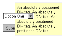
IE 5.5 Screenshot

Some elements cause display problems when overlapped by positioned elements. An example of this is shown in the image at right, taken from IE version 5.5. This can occur when elements overlap form controls, applets or plug-in displays like Flash.

It happens because browsers may let other programs handle the display of these elements, like a plug-in or the operating system. Even setting the z-index will not help. These other programs control that space and will simply draw on top of whatever the browser renders.

Which elements "bleed through" depends on the browser. Netscape 6 and IE 5.5 manage all form controls themselves, except for SELECT elements. With IE, these will display on top of any other content. With Netscape, the select box itself works as expected but the scroll bar will bleed through if the SIZE attribute is greater than one. Opera 5.0 has this problem with all form elements.

This cannot be fixed. Your only recourse is to try to avoid overlapping such elements. In some cases, you might know or be able to dynamically detect an overlap and hide the offending element from view by setting its style via scripting using settings like visibility:hidden or display:none.

Conclusion

Even though this is just a brief overview, you can see that many details go into how a browser renders page content. And this information deals just with positioning. Stylings, form controls and dynamic content changes via scripting can complicate matters even more.

Even when browsers follow the standards, there is plenty of room for error. All software has bugs and specifications can't cover every possible situation.

When designing layouts, code validators can be helpful in finding simple errors like unmatched HTML tags or syntax errors in style sheets. Sometimes it helps to build a small test case and view it in several different browsers or configurations to pin down a particular problem.